
A friendship built on the pedals
Francesco came into Stelbel’s world in the early months of our 2015 relaunch, as a cyclist first and a designer second. He followed our frames as they were being built, bringing the same attention to detail that runs through projects like Designing News, IL and Robinson, and that earned him a place in the Alliance Graphique Internationale. But in the workshop, in Bergamo, he always showed up with his bike and the questions of a curious mechanic — not those of a design name.
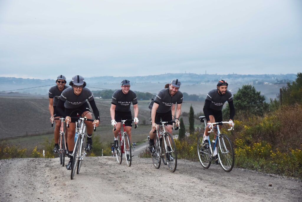
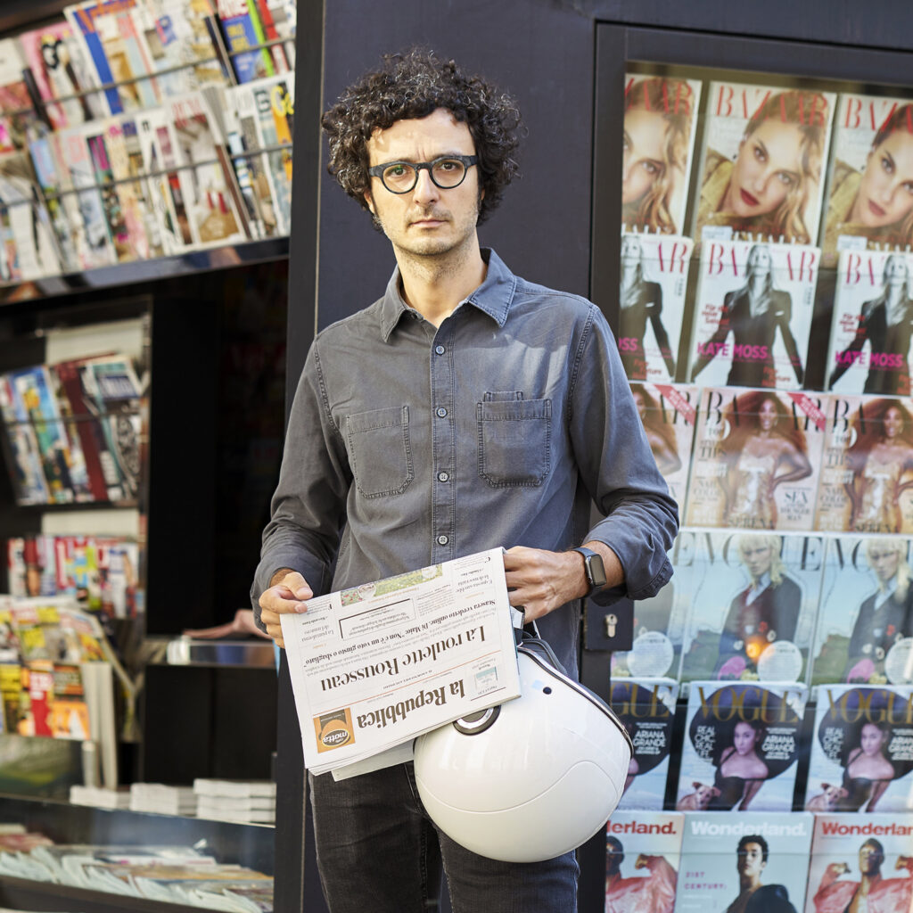
Eroica 2019, Art Director La Repubblica Milano
From the road to the page: the 2022 SB/03
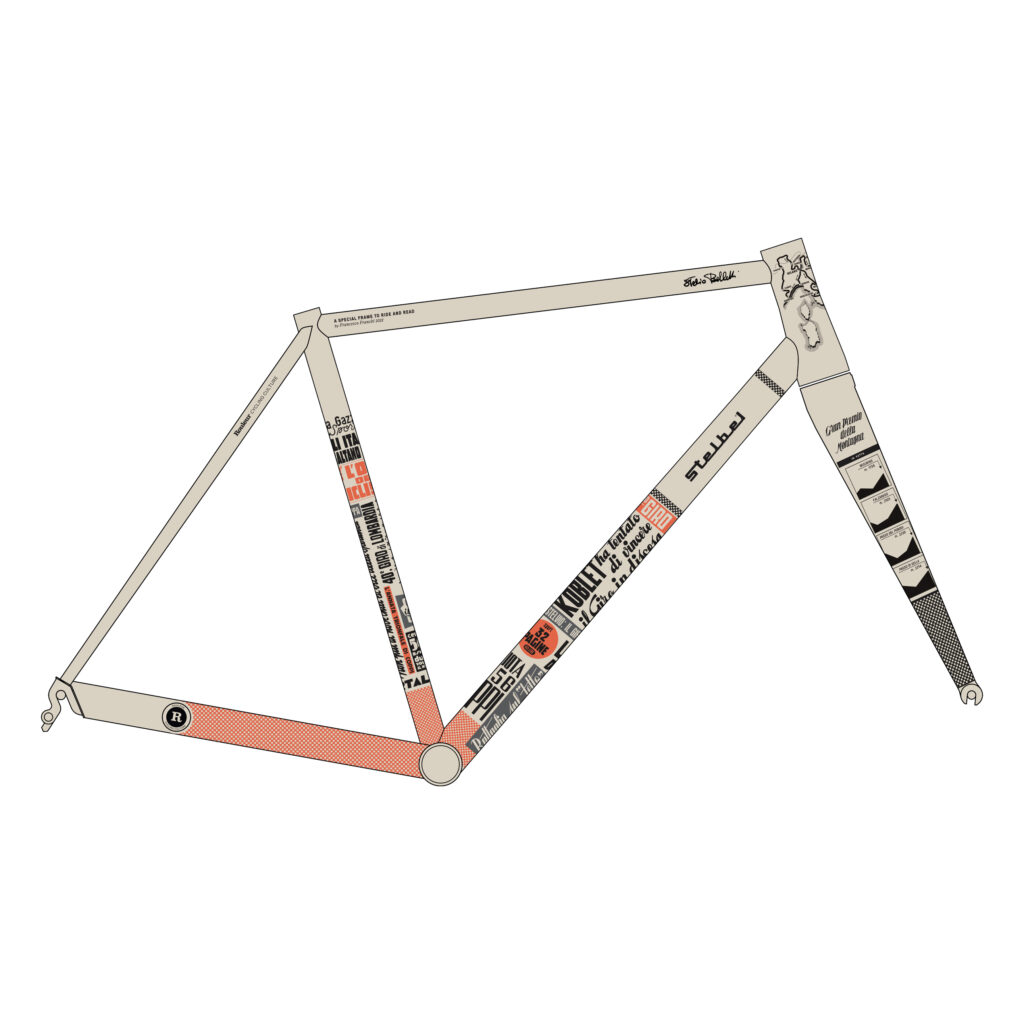
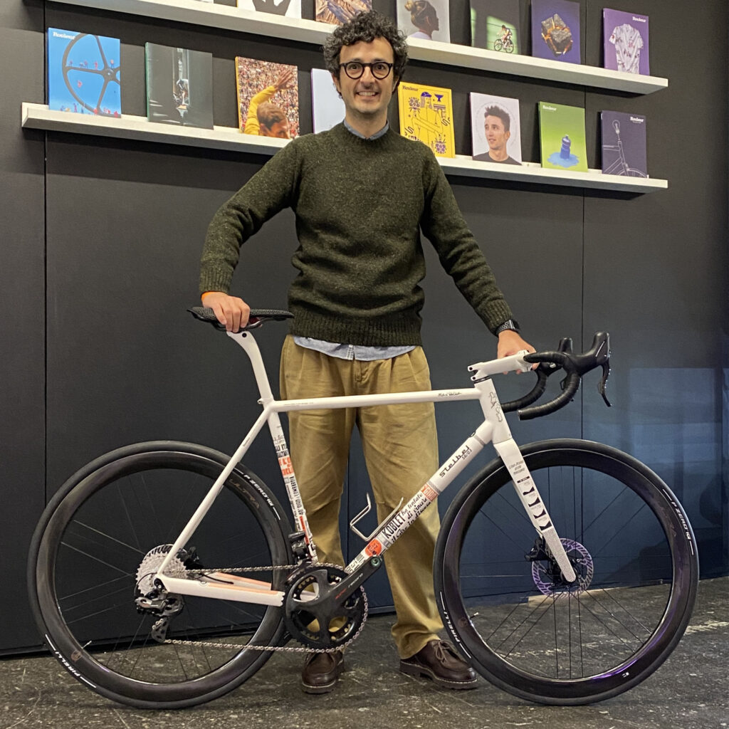
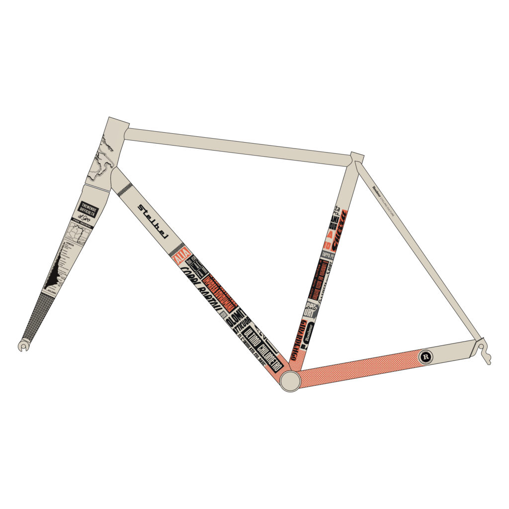
Alongside a number of smaller projects and two bicycles built for him, this friendship found its fullest expression at Rouleur Live in London, in 2022. For that occasion, Francesco designed the livery of the SB/03 Evoluzione — the bike that marked our shift to full cable integration.
Drawing on the front pages of 1950s sports newspapers — when cycling was told in full-page spreads with hot-metal headlines — Francesco built a visual language that brings together editorial storytelling and mechanical precision. The project, made together with illustrator Riccardo Guasco, sold out within days. That SB/03 left a mark on how we think about the brand today: a bicycle isn’t just an object to look at, but a story to lay out on a page.

Rethinking, not restyling
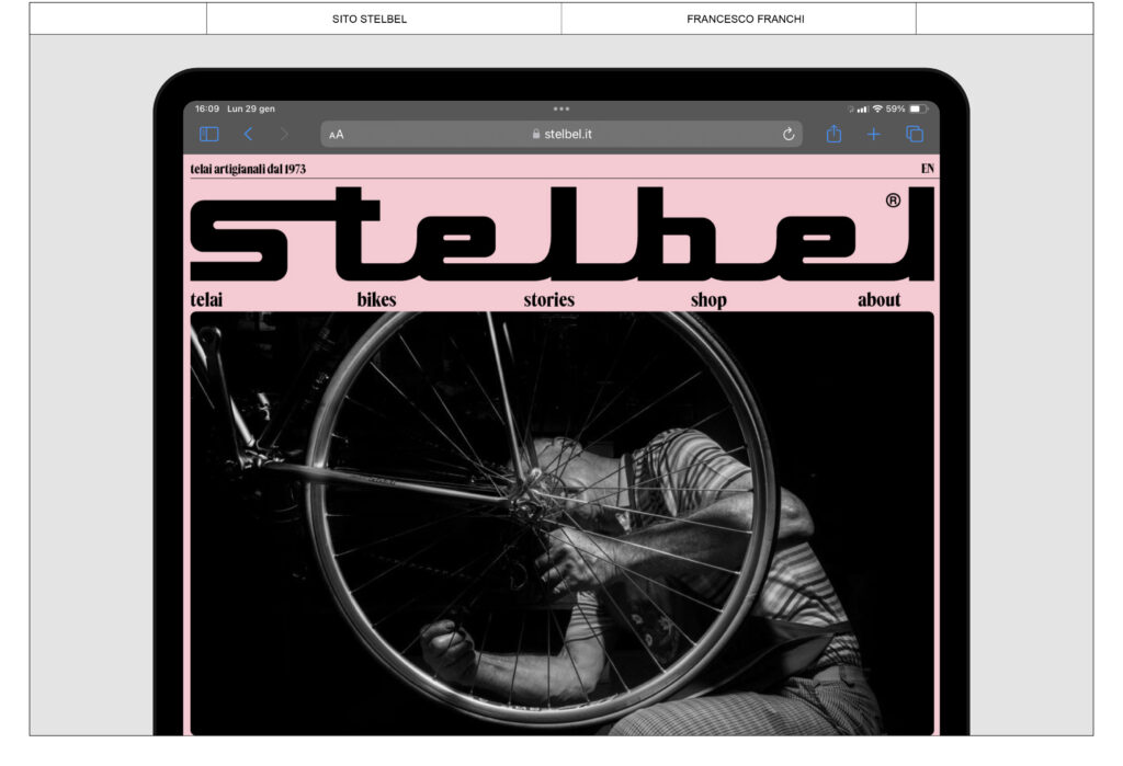
When we started talking about the new website, Francesco made one thing clear from the start: this wouldn’t be a restyling. It would be a rethinking. The point wasn’t to change colours or refresh typefaces at the surface, but to build a system that could carry the story.
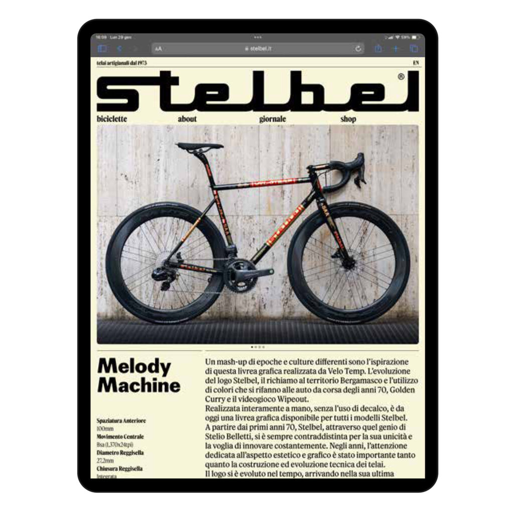
Francesco’s work focused where it really matters: in the choice of typefaces and the construction of an editorial grid. It’s the same logic that runs through the magazines he has worked on for years — clear hierarchies, rhythm of the page, the relationship between text and space — applied to a site that until yesterday was a catalogue, and today wants to be something closer to a magazine. Typography isn’t a decorative detail: it’s the tool through which ideas are ordered, distinguished, given weight. When it works well, the reader doesn’t notice it; they only notice that they understood.
The result is a site that has stopped shouting and started speaking. Pages are read, not scrolled; information carries different weight depending on how much it matters; and Stelbel’s identity emerges from the shape of the storytelling itself, not from graphic elements stacked on top.

Credits
Most of the photographs on the new site are the work of Federico Vandone Dell’Acqua, whose eye has accompanied our workshop for some time now. Web development was handled by Tilt in Bergamo, who translated Francesco’s design — with patience and precision — into code.
What’s left, when you take away what isn’t needed
There’s a way of working that’s shared by people who weld a frame by hand and people who lay out a page with care: you take things away, you don’t add them. You start from what really matters, and you remove everything else. Stelbel’s new website grew from the same conviction, and that’s why it feels like us. It isn’t a brand showcase: it’s a natural extension of the Bergamo workshop, where every frame passes through the same hands, one bike at a time, since 1973. Come in, take your time, and let us know what you think.

