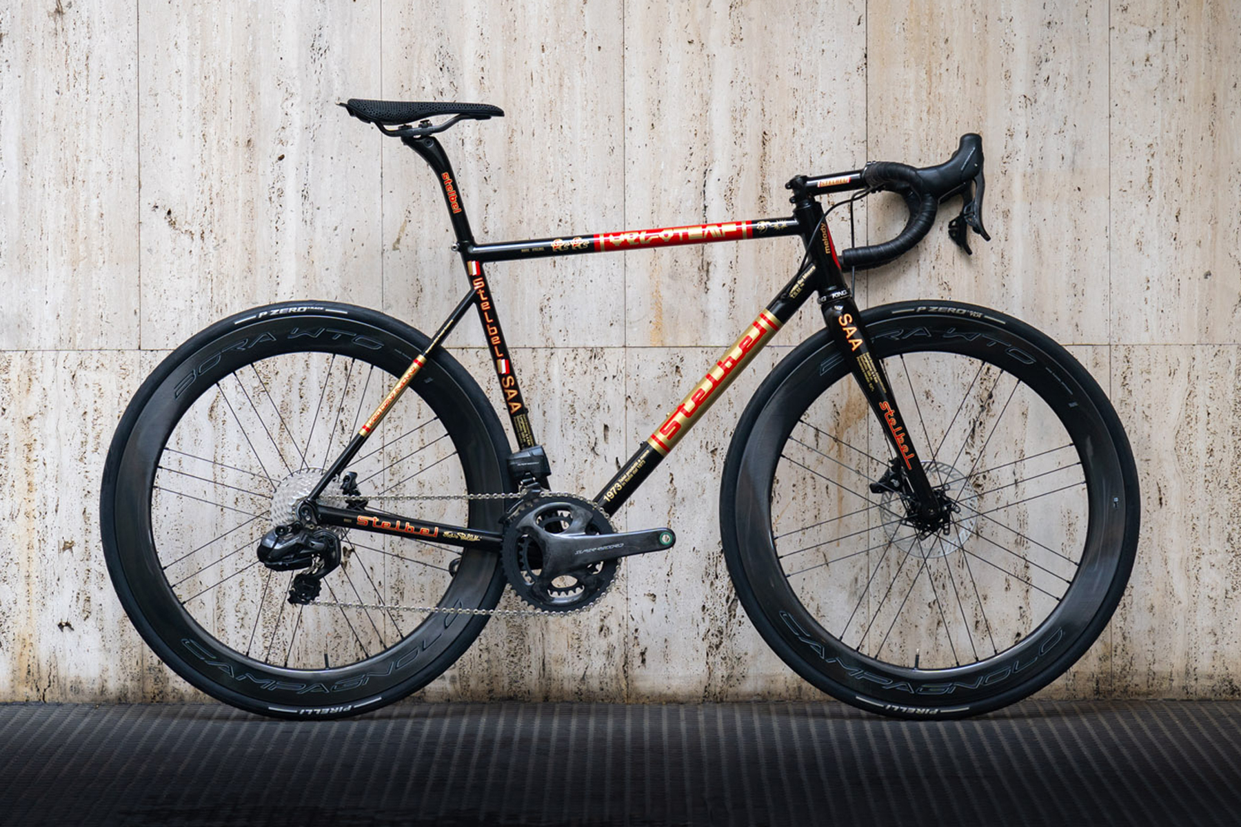
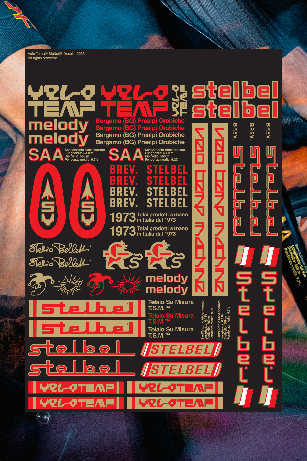
A mash-up of different eras and cultures serves as the inspiration behind this graphic livery crafted by Velo Temp. The evolution of the Stelbel logo, a nod to the Bergamo territory, and the use of colors reminiscent of 1970s racing cars, Golden Curry, and the video game Wipeout all come together in this design.
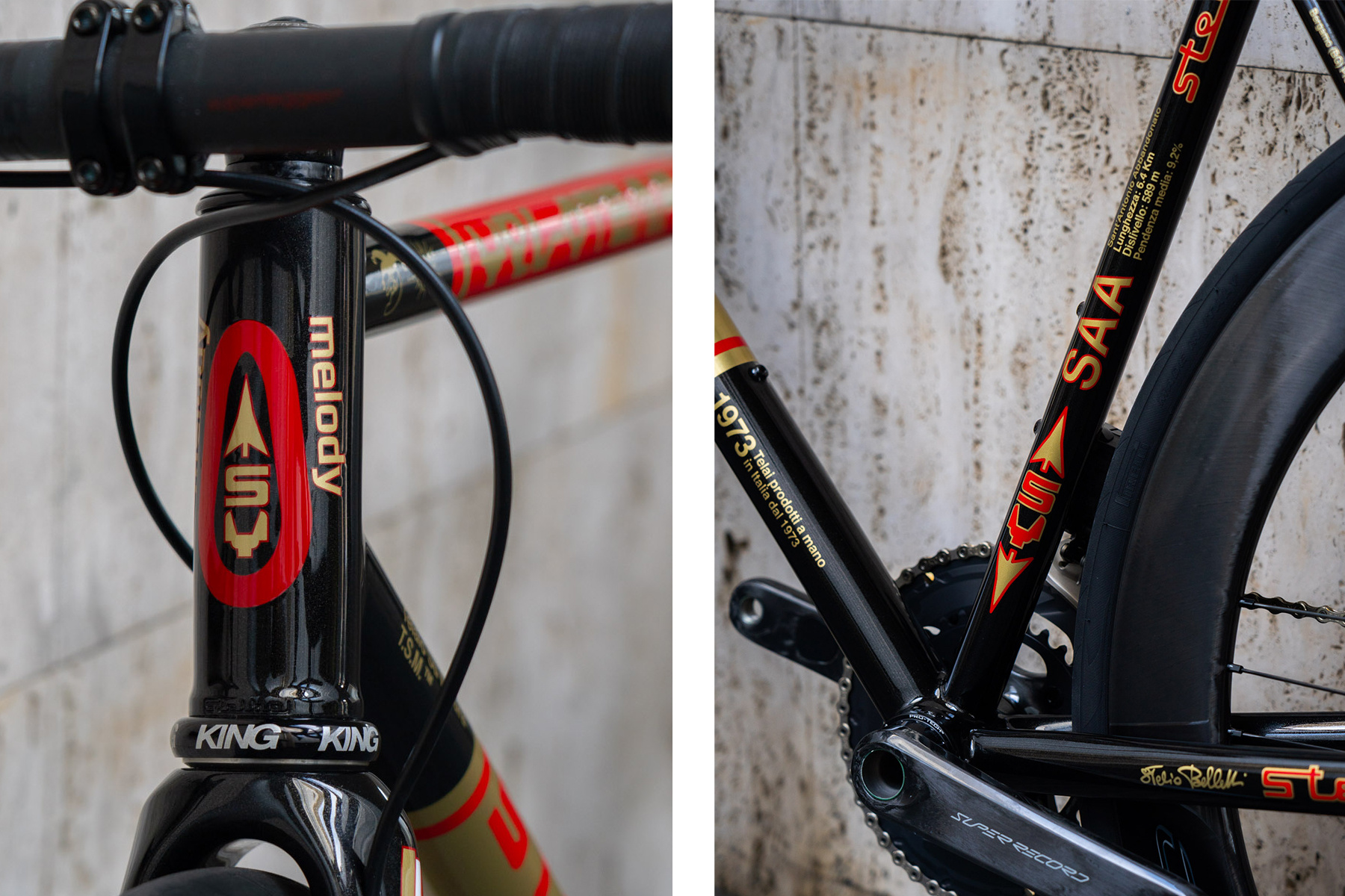
Created entirely by hand, without the use of decals, it is now available as a graphic livery for all Stelbel models.
Since the early 1970s, Stelbel, under the visionary Stelio Belletti, has always stood out for its uniqueness and constant desire to innovate. Over the years, the attention devoted to aesthetic and graphic aspects has been as important as the construction and technical evolution of the frames.
The logo has evolved over time, culminating in its latest version, representing a futuristic design for its time and still relevant today. The folks at Velo Temp went wild exploring catalogs, price lists, and promotional publications in the archives, discovering many unconventional graphic designs for that era. It all started from there, tracing the evolution of Stelio’s logos and symbols used to create graphics and decals for his frames.
The predominant connection is with the Bergamo region where our activities take place. SAA, an acronym for San’Antonio Abbandonato, is one of those lesser-known climbs, perhaps less practiced because it never allows you to catch your breath, from start to finish of its 6.4km with an average gradient of 9.2%.
This graphic design is now an option for painting on any Stelbel frame.
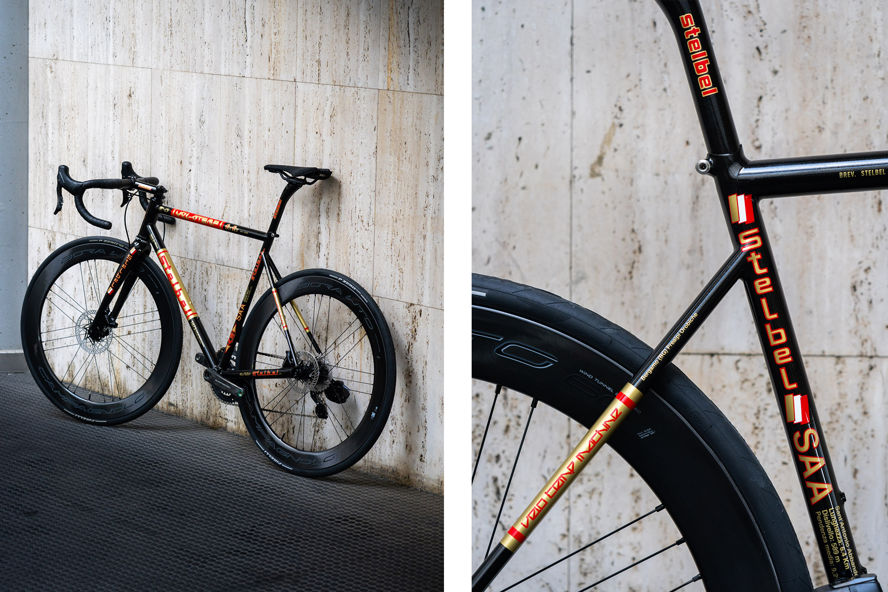
It’s worth noting that it is entirely handcrafted, with no decals applied, so the choice of colors is entirely free. Depending on the size and type of frame, the graphics will be adjusted to fit optimally; some minimal differences may be present, but this is also part of the uniqueness of each Stelbel frame.